As I had little in my portfolio that was relevant, I created an idea for a first page for the author and publishers to consider (it's changed quite a bit since then).
|
|
As I had little in my portfolio that was relevant, I created an idea for a first page for the author and publishers to consider (it's changed quite a bit since then).
0 Comments
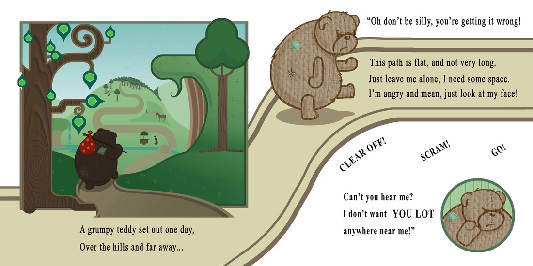
It's been some time since I last posted on my blog, and this is partly because I've been so busy, but partly also because there's only so much information my contract allows me to give. I'm going to attempt to show what I've been doing over the last months in pictures, but I'll summarise here. I've been illustrating a story by author Greg Dobbins entitled The Grumpy Teddy, which is due to be published within the next few months and in anticipation of that, I've decided to show the process from start to finish, including four samples pages from the final book (without text).
As a fitting end to the project I have decided to sum up the project in terms of what I've learnt, how I could have done better, what I'm pleased with and what I can take from it for the future.
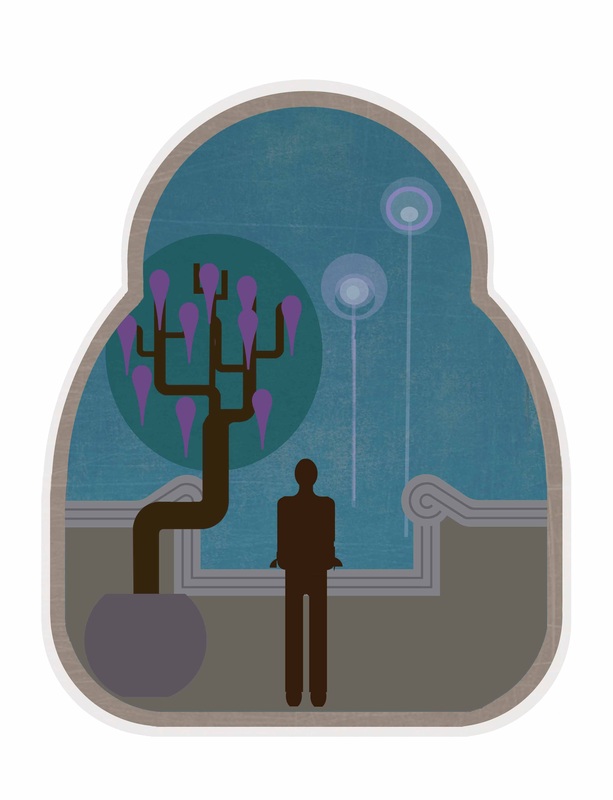
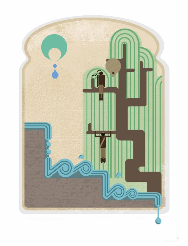
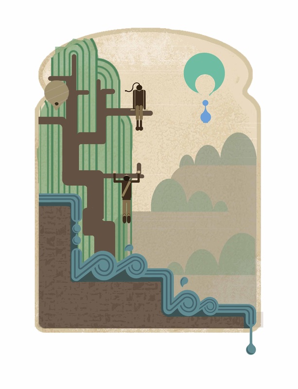
Overall I'm delighted with the images I've created and the fact that I came up with those ideas. This project is the result of three years of learning how to conduct a project from start to finish and I've used all I've learnt, put it into this project and discovered that I now have a working process to follow as an illustrator, which is a hugely important thing to take away with me for the future. I've also pushed further some techniques and styles that I'd used previously to find that along with the process, I've developed my style into something more unique and personal to me. Most of all I've learnt not to let external pressures get in the way of work because however hard it is, it will cause problems later, and that is certainly something I could have done better. However more positively I've learnt that even when it's left late, it is possible to salvage a project by putting heart and soul into it a pushing yourself beyond anything you thought you could do. Much later on in this project I began to think about creating a survival guide and that is something I would like to take away with me into the future. I would like to develop the survival guide to create more pages and improve the design. There is also a competition to have work displayed on the official Hunger Games facebook page (details at: http://glossi.com/CatchingFire/contest/8-illustrate-your-spark-catching-fire-ch-1 ), which is to illustrate the first chapter of the next book which is ideal. The deadline is 14th June, so there's time to finish all my work and get working on that as a way of showcasing my work. Another thing I have learnt and that I can take forward is my journal. I've found it incredibly useful to have a page where I can take my images out of their original context to compare them and to comment on them. It has also helped me to constantly pause and reflect on what I'm doing and rather than slow the process down it has given my work more direction. I'm now excited about my future in illustration and feel confident that I have something unique to offer, and a place in the world of illustration. 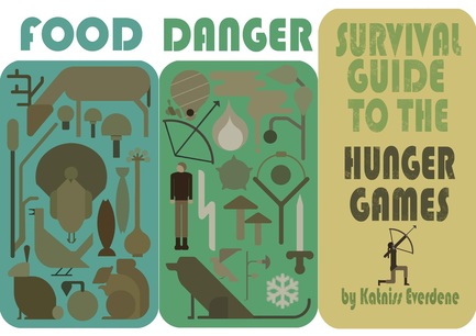 During this project I've been thinking about the theme of survival and I also wanted a way to present some of the Hunger Games Hannah Style world I started to draw when I was coming up with ideas for this project. I've drawn up this (left). I don't feel that it's finished as I would've liked to have made the images fit together better, and change the colours slightly amongst other things. However I've run out of time, so for now, I'm doing a test piece to hand in with my project, which I am in the process of transferring to wood, to be bound into a Roman tablet style survival guide. It has to be printed on laser jet to do the transfer and the college printers were out of use today, but I've managed to overcome that although there is a colour issue (from photocopying an inkjet print). Well the deadline is Thursday, so I'm almost there and I'm just tying up loose ends and writing lists in minute detail.
I've finished and tidies up all four images. I printed three of them on beautiful matte paper, but as it was the first time I'd printed them at that size (A2), there were some little alignment problems that I'd missed, and although others probably wouldn't notice them, I did, so I've decided that in spite of the cost I will print all of them again. And for my portfolio too!
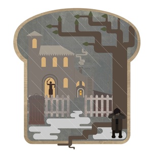
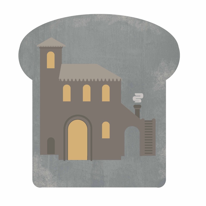
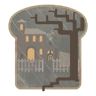 This is the latest image as far as I've done it. The picket fence is more a reflection of a US "back yard" than a Roman one - there has to be something to identify the location! The house is based on a combination of two different ancient Roman houses, one in Rome, one in France with the addition of a Roman style baker's oven, uncannily like those discovered in Pompei! I'm actually quite enjoying doing this illustration, and it's gone fairly smoothly so far! There's still more work to do on it however.
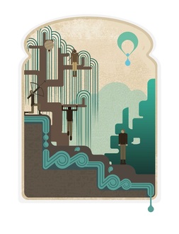
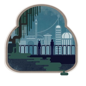
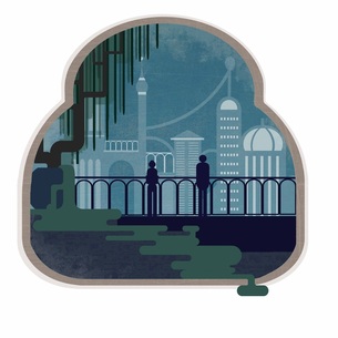
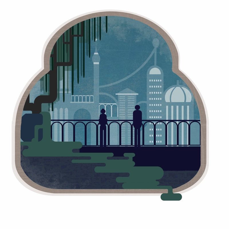
This is the image that I'm most pleased with the progress at the moment. The first image was just a quick putting down of the idea in my head and seeing if it worked. It didn't! I didn't get as far as putting the city in the background before I abandoned it. The idea was to try and get the balcony to match the river of the first illustration and I drew sketch after sketch of balcony designs trying to make it work, but big ones were too clumsy and narrower ones looked too real and ornate. Then after going back to my thumbnail sketches and the book, I decided a railing was better. Going on the Roman theme in the book I've based the railing on an aqueduct and also the city has some domes, arches, "aqueduct" railings etc based on Roman architecture. I'm very pleased with the sense of space, but it caused me a lot of problems when I went back to the first illustration, as mentioned. I still need to put fireworks in, as the book mentions the noise of a celebration and this was the best way I could think of to impy
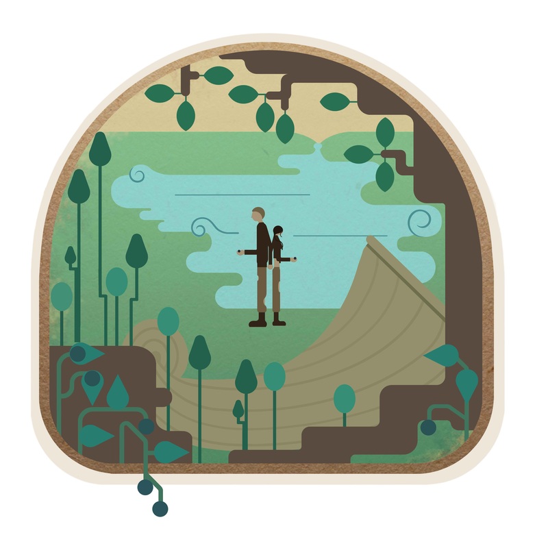
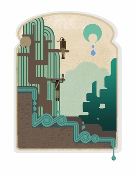
This is the first image I worked on for this project. Below left is my first image and then after creating a second illustration I and realised it didn't match, so I added a background to give more depth. I like the depth this creates but I'm not happy with the background itself, the trees and hills look a little solid and clumsy. For now though, I've moved on to other images and will revisit it later (and sort our the raggy tree edges at the same time).
| ArchivesFebruary 2015 AuthorMy name is Hannah Rees and as you can see, I'm an Illustrator! The work posted here is information on my current or recent creative activities. Enjoy! ArchivesFebruary 2015 CategoriesAll |
 RSS Feed